
Passion Project
A ministry designed to quietly meet everyday needs through anonymous giving, rooted in the belief that every individual is deeply cared for by God.
As a designer, I’ve always believed that the highest calling of my work is to serve others, especially those who feel unseen.
Inspired by a passage in the Gospel of Luke, Corvo is rooted in the truth that we are deeply cared for by God. Just as He tends to the ravens, Corvo exists as an extension of that divine care by meeting every day needs that slip through the cracks of traditional aid. Corvo lets anonymous members quietly meet these real needs by submitting, funding, or supporting them through a shared pool.
Corvo was designed to showcase the beauty of a selfless love for others that doesn’t ask for anything in return.

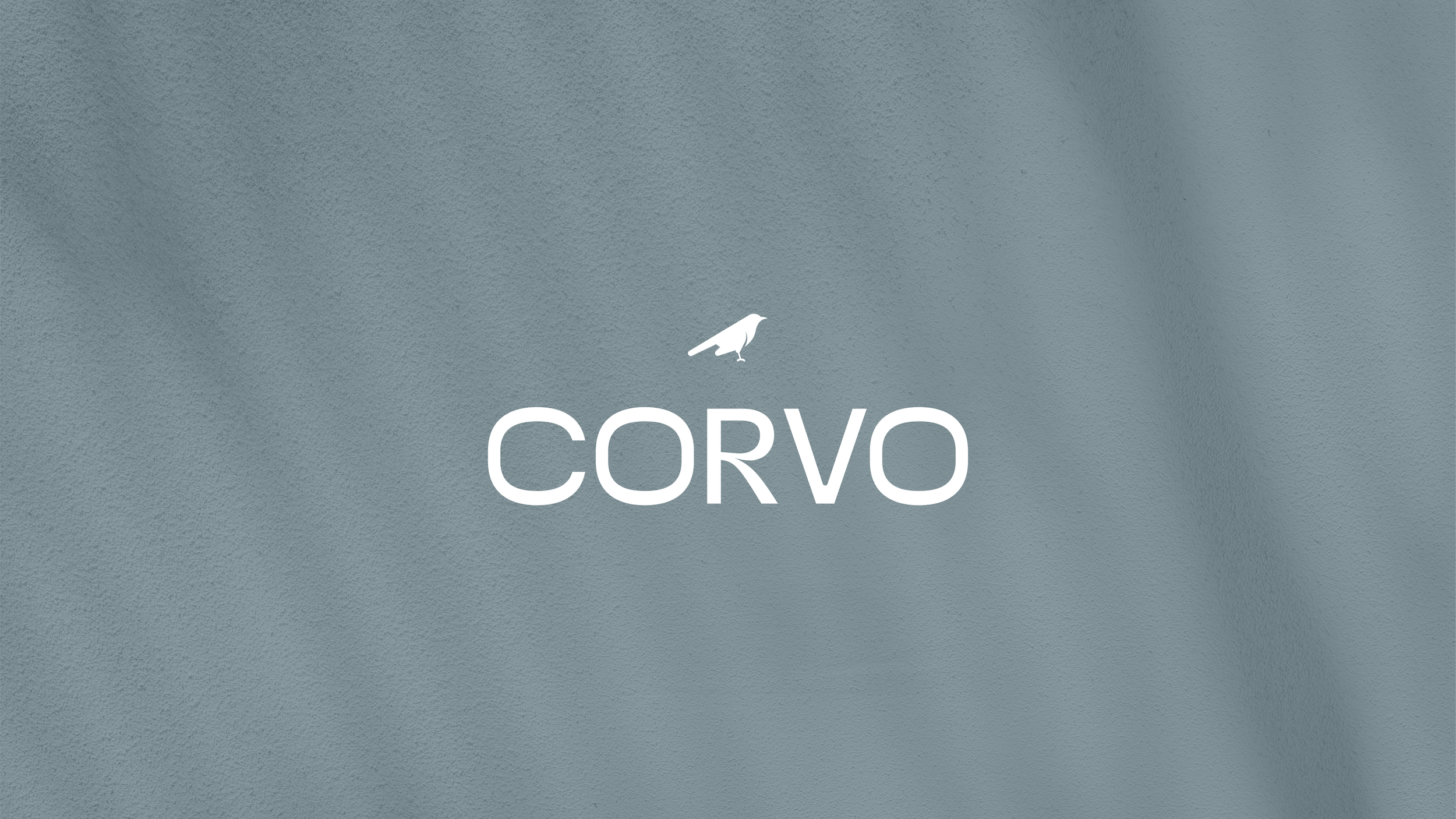
Logo System
The identity is built around the balance between structural clarity and modern warmth. The primary wordmark is a custom rework of Panel Sans, chosen for its clean geometry and generous counter forms to ensure strong brand recognition at any scale. Its contemporary aesthetic sets the tone for a mission-driven brand that steps outside traditional expectations of nonprofits and aid organizations.
The raven icon was designed to mirror the wordmark’s geometric precision, using a system of circles and simple forms. When combined, the two elements create a cohesive and confident presence that reflects the full spirit of the brand.


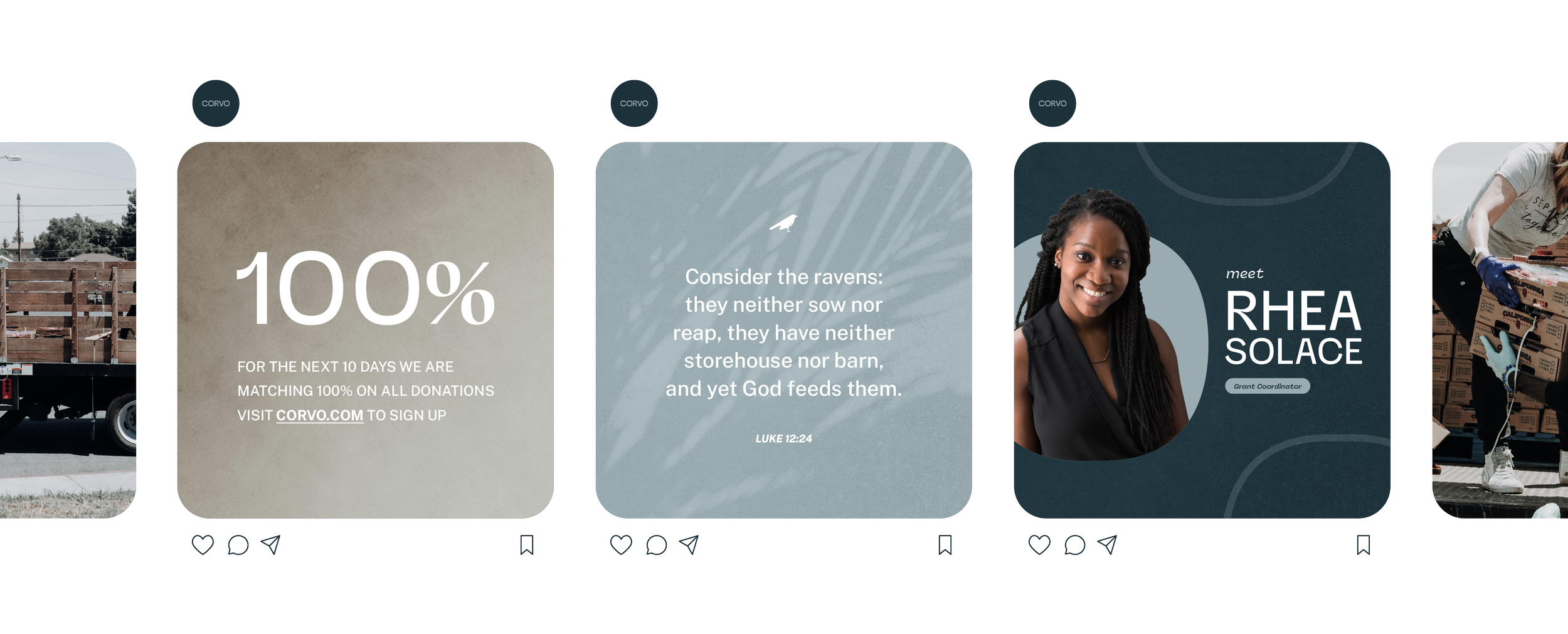
Social Media
As a community-driven nonprofit, Corvo relies on the public to identify needs, making social media an essential tool. A strong presence not only expands reach but also educates the community on how Corvo works and empowers individuals to take part in the system. Clearly communicating this shared responsibility allows Corvo grow and impact more lives each year.

Brand Collateral
Corvo’s geometric identity opens up endless opportunities for thoughtful and recognizable collateral. A standout example is the business card design, which draws from the unique circular form of the “O” in the logo. That shape inspired the card’s custom rounded corners, creating a subtle but distinct detail that reinforces the brand’s visual language.
